New Logo
With the new century, and with 57 successful years behind it, the Society has created a new logo to reflect its unique character and mission, and to mark its distinctiveness in a highly visual way useful for the digital age.
History of the Society Logo
The Society was formed in 1960. A logo was developed at that time that includes an image of the State of Arkansas, an arrowhead, a shovel, a notebook and a quill pen. This logo was typical of the time and has served the organization well. Later, it was modified, adding the words “Arkansas Archeological Society” around the original logo to clarify the meaning of “AAS.” Many organizations have similar logos, using images like artifacts and shovels or the outline of a state as part of the design, and a circular border.
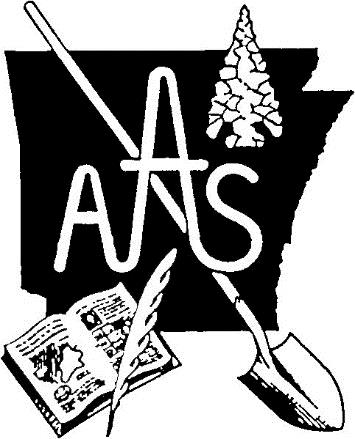
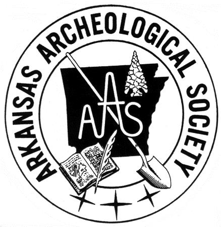
Original Society logo Second Society logo
As archeology moves into the 21st Century, the Executive Committee of the Arkansas Archeological Society decided it was time to develop a new, unique logo that is graphic, meaningful, and will withstand the test of time. Many ideas for the main image were suggested and hashed out. The committee searched for an image associated with Arkansas history (or that had some Arkansas connection). The goal was to find something that could not be confused with any other organization or company inside or outside of Arkansas. Several ideas were brought up for images from across the state, including the idea of using an image from Native American rock art. Rock art offers a variety of images to choose from. After much deliberation, the Executive Committee selected the double nested diamond motif. This motif comes from site 3CN20 located near Morrilton. It is one of several geometric motifs used in pictographs and petroglyphs on bluff faces, cave walls, and large boulders by some of the first Arkansans.
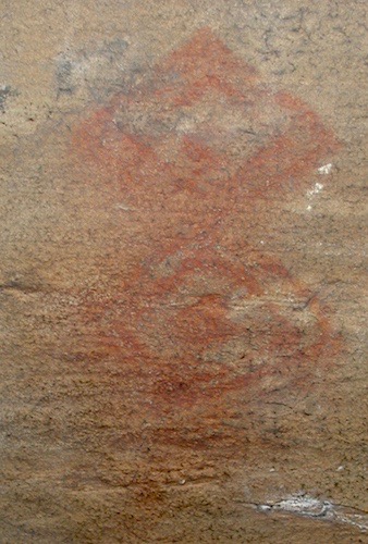
New logo inspiration
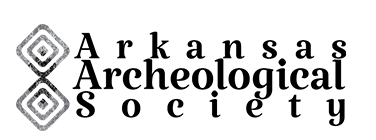
Geometric shapes offer clean lines and have simple, recognizable forms. Several of the Executive Committee members tried their hands at coming up with a rendition of the double nested diamond motif, which was then sent to a graphic designer to refine and add texture reminiscent of stone and paint.

New Society logo
Geometric shapes can hold a variety of meanings according to the culture or individual viewing or using the shapes. We do not know exactly what the Indians who created this image intended it to mean, but we can respect it as an artistic symbol created by people who inhabited this land in previous centuries and whose material culture we often work to study and preserve. For the Society, diamonds also provide other connections with Arkansas. Before Arkansas was “The Natural State,” it was “The Diamond State.” A diamond is still visible on some Arkansas license plates and is the dominant shape on Arkansas’s state flag. The double nested diamonds can also symbolize the organization itself and the unique relationship the Society has with the Arkansas Archeological Survey. For example, looking at the top diamond, the outer diamond might be the Society, the middle diamond the Survey and the center diamond the individual. Moving to the bottom diamond, the outer diamond would be the Survey, the middle diamond the Society and the center diamond, again, the individual. Thus, the image can symbolize the closeness with which the two organizations work together, relying on the individual members of both groups to achieve common goals of protecting and preserving sites, conducting proper research, and sharing information with the citizens of Arkansas. The font used to complete the new design was selected for its nice lines and curves and for the dots on the “i” that have a slight diamond shape. The structure of the logo retains the traditional “AAS.”
These are the reasons that the Executive Committee selected the double nested diamond for the new Arkansas Archeological Society logo. Members of the Society nationwide and the citizens of Arkansas will begin seeing this logo used on all aspects of the Society’s activities and publications. The Executive Committee has worked very hard on this new identity and hopes that members and other interested individuals will support this change.
